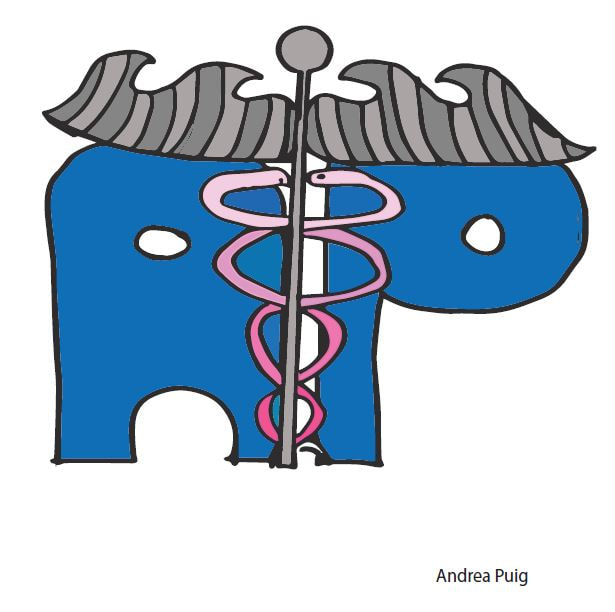
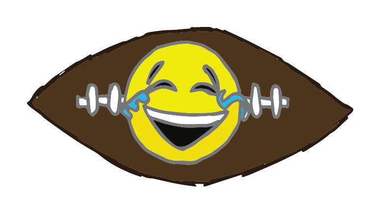
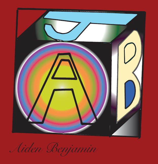
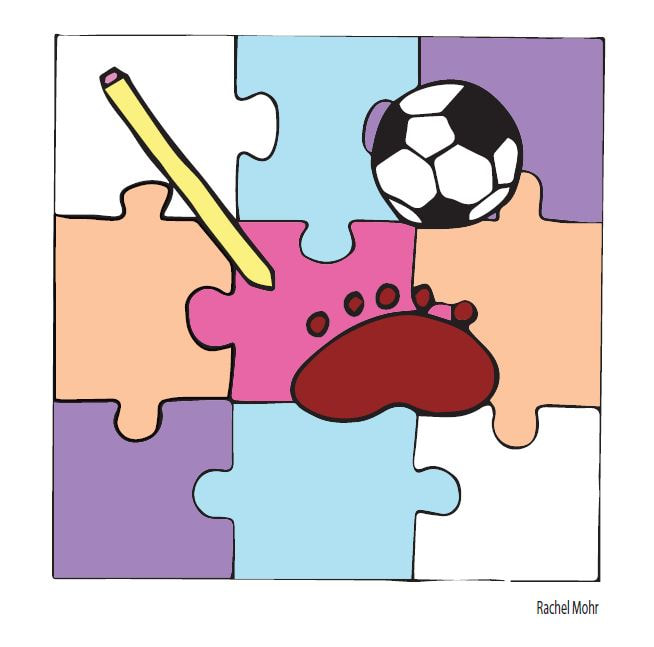
Personal Logo Design Student Examples


Personal Logo Design
Before you design a logo, you must understand what a logo is, what it represents and what it is supposed to do. A logo is not just a mark – a logo reflects a business’s commercial brand via the use of shape, fonts, colour, and / or images.
A logo is for inspiring trust, recognition and admiration for a company or product and it is our job as designers to create a logo that will do its job.
Now that you know what a logo is supposed to do, and what it should represent you now must learn about what makes a great logo aka; the basic rules and principles of effective logo design.
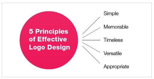
1. A logo must be simple
A simple logo design allows for easy recognition and allows the logo to be versatile & memorable. Good logos feature something unexpected or unique without being overdrawn.
2. A logo must be memorable
Following closely behind the principle of simplicity, is that of memorability. An effective logo design should be memorable and this is achieved by having a simple, yet, appropriate logo.
3. A logo must be timeless
An effective logo should be timeless – that is, it will stand the test of time. Will the logo still be effective in 10, 20, 50 years?
4. A logo must be versatile
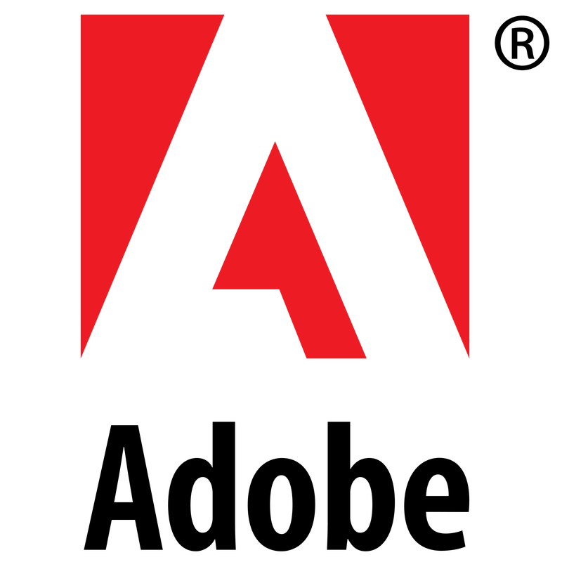
An effective logo should be able to work across a variety of mediums and applications. For this reason a logo should be designed in vector (Adobe Illustrator) format, to ensure that it can be scaled to any size. The logo must work in just one colour too.
5. A logo must be appropriate
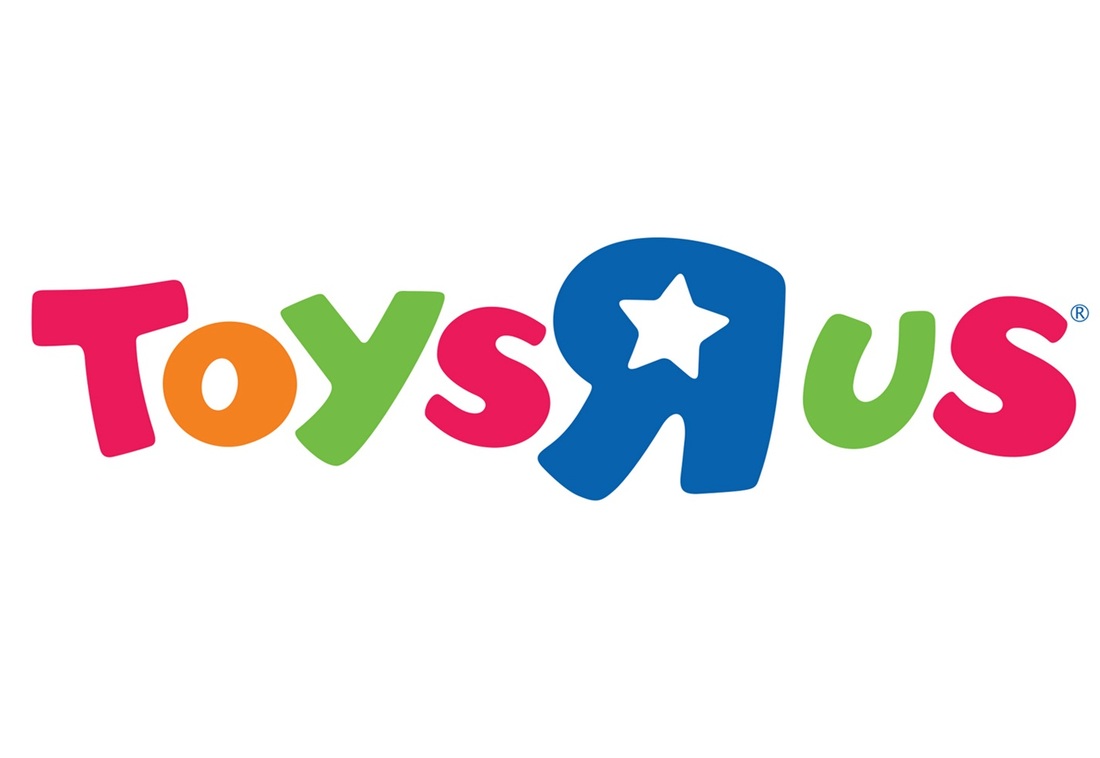
How you position the logo should be appropriate for its intended purpose. For example, if you are designing a a logo for children’s toys store, it would be appropriate to use a childish font & color scheme. This would not be so appropriate for a law firm
A logo is for inspiring trust, recognition and admiration for a company or product and it is our job as designers to create a logo that will do its job.
Now that you know what a logo is supposed to do, and what it should represent you now must learn about what makes a great logo aka; the basic rules and principles of effective logo design.
1. A logo must be simple
A simple logo design allows for easy recognition and allows the logo to be versatile & memorable. Good logos feature something unexpected or unique without being overdrawn.
2. A logo must be memorable
Following closely behind the principle of simplicity, is that of memorability. An effective logo design should be memorable and this is achieved by having a simple, yet, appropriate logo.
3. A logo must be timeless
An effective logo should be timeless – that is, it will stand the test of time. Will the logo still be effective in 10, 20, 50 years?
4. A logo must be versatile
An effective logo should be able to work across a variety of mediums and applications. For this reason a logo should be designed in vector (Adobe Illustrator) format, to ensure that it can be scaled to any size. The logo must work in just one colour too.
5. A logo must be appropriate
How you position the logo should be appropriate for its intended purpose. For example, if you are designing a a logo for children’s toys store, it would be appropriate to use a childish font & color scheme. This would not be so appropriate for a law firm
Industry says....Start out right!
When you’re in the market to have a new logo developed, there’s always the temptation to take some short cuts. Usually to save time, money or a combination of both. Trouble is, most ‘cookie cutter’ solutions will turn out to be neither inexpensive or fast, and may cause a ton of headaches down the road – especially when your fledgling company starts to become more high-profile. Some examples? You may think about using a clip art logo (not a good idea – the image probably isn’t licensed for use as a logo or if it is, is already being used by a load of other people.) You may think about downloading, or even customizing, a "ready made" logo template. Not a particularly good idea either – these templates are arguably still clip art and as most template sites are ‘anonymous’ you’re never going to be sure if the work is original (for what it’s worth, we regularly find our client’s logos being passed off on templates.) Even if the work is legit, it certainly won’t be unique because the basic premise of ‘logo templates’ is that many people using the exact same design – the antithesis of what branding is supposed to be about. Further, if the logo is unique, the chances that you’ll get the correct file formats are slim to none. Hosting a logo design contest has similar drawbacks and caveats. At the end of the day, there’s only one effective way to design an original and effective logo, and that's to create a unique design without using any of the above sources.
When you’re in the market to have a new logo developed, there’s always the temptation to take some short cuts. Usually to save time, money or a combination of both. Trouble is, most ‘cookie cutter’ solutions will turn out to be neither inexpensive or fast, and may cause a ton of headaches down the road – especially when your fledgling company starts to become more high-profile. Some examples? You may think about using a clip art logo (not a good idea – the image probably isn’t licensed for use as a logo or if it is, is already being used by a load of other people.) You may think about downloading, or even customizing, a "ready made" logo template. Not a particularly good idea either – these templates are arguably still clip art and as most template sites are ‘anonymous’ you’re never going to be sure if the work is original (for what it’s worth, we regularly find our client’s logos being passed off on templates.) Even if the work is legit, it certainly won’t be unique because the basic premise of ‘logo templates’ is that many people using the exact same design – the antithesis of what branding is supposed to be about. Further, if the logo is unique, the chances that you’ll get the correct file formats are slim to none. Hosting a logo design contest has similar drawbacks and caveats. At the end of the day, there’s only one effective way to design an original and effective logo, and that's to create a unique design without using any of the above sources.
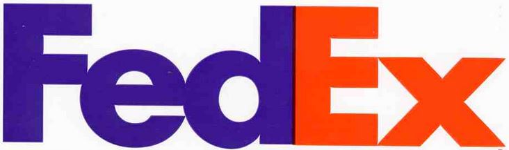
A logo doesn’t have to convey what your company does. More often than not, business logos don’t actually portray what the company does. Or creates. Think the McDonald’s Golden Arches. No hamburgers. Think the FedEx logo. No trucks or planes (though a cool ‘hidden’ arrow.) Think the Nike swoosh. No sneakers or golf shirts. Etc. While sometimes having a logo that portrays an element of the company is appropriate, it’s often better to have a corporate logo that’s graphically void of detail – a logo that can be adapted to whatever direction the company takes. Think the Apple logo. True, it is an apple. But there’s no indication that it belongs to a computer company. That’s a pretty cool thing – the Apple logo looks just as cool on an iPod as it does on the lid of a Mac Book Pro.
FAMOUS LOGO INSPIRATION....